
What is Podaris:Insight?
Podaris:Insight is a toolkit for simplifying a number of types of accessibility analysis. It is designed to dramatically speed up the process of performing accessibility analysis on networks and datasets created or imported in Podaris. It provides a simple interface through which analysis projects can be created and shared, and the corresponding results exported. You can learn more about Podaris:Insight and the analysis types that it offers here.
What is the Transfer Limit Analysis?
Transfer Limit Analysis is an analysis mode which allows you to specify a base network, locations to travel to or from, maximum access distance to walk and maximum time spend on transit. To complete your analysis you can set the maximum number of transit mode transfers that can be combined with dataset queries, which may be used to perform demographic analysis, for example.
The coloured visual bands indicate the number of transfers necessary to reach a location or group of locations, considering the max access distance. This analysis type enables to determine the number of people accessible per transfer in a single calculation and helps to understand how well connect a network is.
Multiple departure times may be provided, and Podaris will calculate the best accessibility from those times.
At least one location must be specified as a to or from location - however multiple locations can be added either manually or uploaded in the form of a geospatial data file.
Using dataset queries
Datasets and their associated queries can be used to quantify accessibility and answer demographic questions such as "how many residents can access a hospital using up to 2 transit mode transfers?".
Interpreting results

Transfer Limit analysis uses colour coding to visualise the difference in accessibility between the number of transit mode transfers used to reach a place. Each color band show the reachable area by number of transfers required. In this case, within a maximum 1 hour of travel and a maximum 2km access distance, it's possible to visualise the different areas with direct access (green), 1 transfer (violet) or 2 transfers (yellow).
The change in accessible is indicated not just visually, but can be combined with demographic queries to show how many amenities or how much of the population is accessible within a given transfer band.
Exporting results
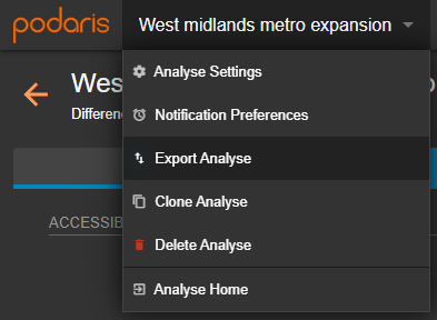
Your analyses can be exported by clicking the project name, and Export Analyse. From here, you can export in a variety of formats, such as GIS and CSV (comma separated values).