What is Podaris:Insight?
Podaris:Insight is a toolkit for simplifying a number of types of accessibility analysis. It is designed to dramatically speed up the process of performing accessibility analysis on networks and datasets created or imported in Podaris.
It provides a simple interface through which analysis projects can be created and shared, and the corresponding results exported. You can learn more about Podaris:Insight and the analysis types that it offers here.
What is the service level analysis type?
Step by Step
1. Add basic information such as a name and description that will be visible to viewers of the project.
2 Select a network and a view to be used in the analysis.
3. Define the zones to measure the service level within. This analysis will aggregate and report the serivce level for the public transport stops within each zone in your location dataset. Analysis zones can take the form of locations imported from a dataset, or be drawn manually by clicking the ![]() button.
button.
4. Define the time period for analysis. The number of departures on stops within a time frame is used to measure the service level of a zone.
6. Click Save and Run Analysis. You will be notified when the analysis is complete.
Interpreting results
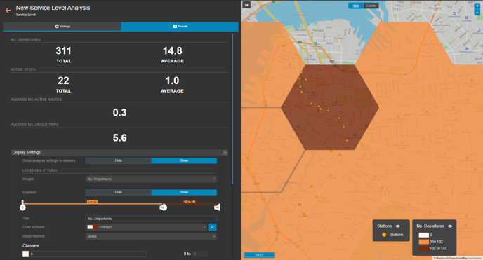
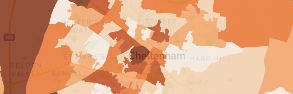
The visualisation depicts both the stations and number of departures for the set time period and analysis zones. The number of departures, active stops as well as the average number of active routes and unique trips are displayed, alongside any calculations derived from your dataset queries.
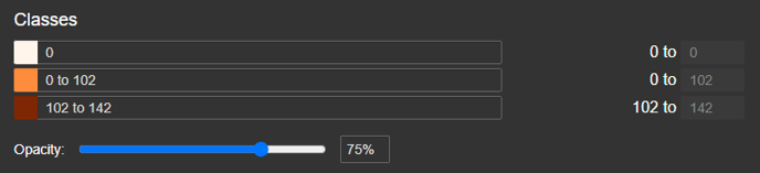
As with PTAL scores, the classes can be defined according to your specifications, either by dragging the classes on the slider:

Classes can also be added or altered in the classes settings, below.
A breakdown of what each output in the results page represents is given in the table below:
| Output type | What this represents |
| No. Active Routes |
Counts the number of services which call at any stop within the zone within the time period set. Each service is counted once regardless of how many stops it calls at within the zone, whether it has both an inbound and outbound trip or just one direction etc. |
| No. Active Stops |
Counts the number of stops which are active in the zone. |
| No. Departures |
The sum of departures from each stop in the zone. For example: 4 stops, made up of 2 northbound and 2 southbound stops, each with an hourly service operating 12 hours a day = 48 departures per day |
| No. Unique Trips |
The sum of departures from each stop in the zone, avoiding double counting where a bus calls at a number of stops in the zone within the same trip. For example: 4 stops, made up of 2 northbound and 2 southbound, each with an hourly service operating 12 hours a day, and with all buses calling at both the NB and SB stops = 24 unique trips (12 unique NB and 12 unique SB trips) |
| Stop Density (stops/sq km) |
Counts the number of stops in the zone, and divides by the area of the zone, to obtain the density of stops for that zone. |
Exporting results
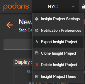
Your analyses can be exported by clicking the project name, and Export Analyse. From here, you can export in a variety of formats, such as GIS and .CSV for either individual or total catchment.