What is Podaris:Insight?
Podaris:Insight is a toolkit for simplifying a number of types of accessibility analysis. It is designed to dramatically speed up the process of performing accessibility analysis on networks and datasets created or imported in Podaris.
It provides a simple interface through which analysis projects can be created and shared, and the corresponding results exported. You can learn more about Podaris:Insight and the analysis types that it offers here.
What is the stop catchment analysis type?
Tip: If you need to compare the stop catchment of two network scenarios side by side — for example a baseline network against a proposed change — use the Difference Catchment analysis type instead.
Station Filtering
Step by Step
1. Add basic information such as a name and description that will be visible to viewers of the project.
2 Select a network and a view to be used in the analysis.
3. Define your isochrone parameters in terms of mode of travel (walk, cycle or car), step type (time or distance) and duration contours. Duration contours are the concentric isochrone bands measuring either time or distance. You can define up to 10 here.
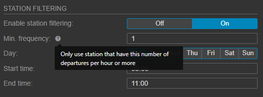
4. Toggle station filtering. When turned on, you can filter stations by factors such as their frequency (the minimum number of departures per hour), day or time.
5. Add a dataset and dataset query if you wish to quantify accessibility (e.g. in terms of population served, as derived from a census dataset).
6. Click Save and Run Analysis. You will be notified when the analysis is complete.
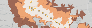
Interpreting results
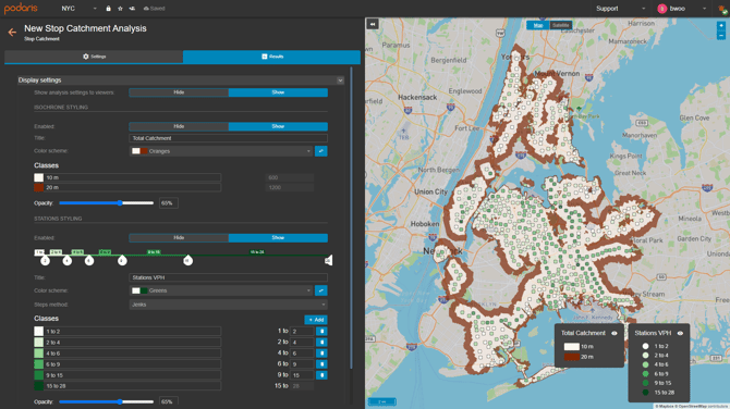
The visualisation and associated legends depict isochrones (coloured according to the duration contours defined in setup), and the individual stations in your imported network (coloured accorded to the number of vehicles per hour (VPH) leaving that station for the set day and time).
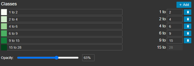
As with PTAL scores, the classes can be defined according to your specifications, either by dragging the classes on the slider:

Classes can also be added or altered in the classes settings, below.
Exporting results
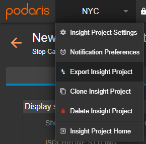
Your analyses can be exported by clicking the project name, and Export Analyse. From here, you can export in a variety of formats, such as GIS and .CSV for either individual or total catchment.